TRENDING
Tacky Living Room Mistakes Everyone Makes
Published
5 years agoon
Living rooms are the ultimate entertaining space, whether it be when guests are over, or your own family is gathering for a movie night. And for that reason, you want a room that’s comfortable, yet spacious and functional. Style is important, but it’s easy to get carried away.
 There are some glaring mistakes many people make when designing their living room, and most don’t realize how outdated and tacky some of these “features” can be. Unfortunately, not everything trendy is practical, so here are the biggest mistakes you might be making when it comes to your living room’s design and decor.
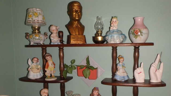 Sure, it’s cool to save your family heirlooms and pick up cool figurines at the antique shop, but cluttering your entire room with knick knacks is definitely a no-no. Not only do they distract the eyes and feel busy, they also gather tons of dust and look silly without a theme. Try and confine these to a special case, preferably in a separate room.
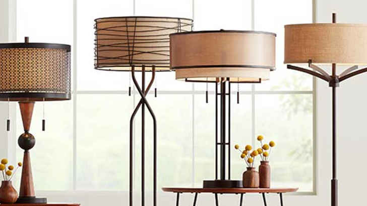 We all need some light in places where we may not have fixture’s overhead, but these crazy lamps have to stop. Multiple arms, bizarre shade covers, wildly curved frames – they all can throw off a room instantly. It’s alright to have a cool lamp, but make sure it fits the color and mood.
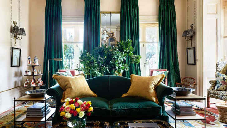 Coordination is important when it comes to interior design, but too much matching can get you in trouble fast. When you match your curtains with something like a couch, both the side walls and floor all start to blur together. This can seem very cheesy, and often makes a room look outdated, or too forced.
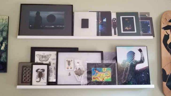 Everyone loves showing off their favorite memories, and what better place to do it than in your most lived-in room. However, if these pictures are just presented all willy nilly, and propped against a shelf or vase, you probably should frame them. This helps subtly tie the room together and makes your family and friends more proud to be presented in an eye-catching way.
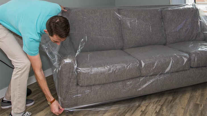 We all know how paranoid one can get after investing in a new couch and never wanting to expose it to whatever fate may come, but keeping a plastic cover on is the definition of tacky. Not only does it look like you have trust issues, but it’s also incredibly uncomfortable, which is basically the main point of a living room in the first place.
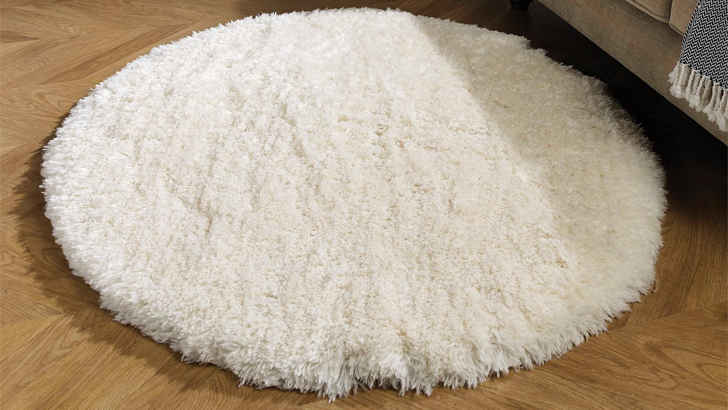 Let’s be frank – small rugs serve no purpose, and mostly throw off a room by adding an extra item. You don’t want the floor to have too many things, and since rugs are meant to pull rooms together, small rugs just feel discombobulated. They’re also usually impractical, not really providing a purpose. Rugs should be large, and have two legs of furniture on it if possible.
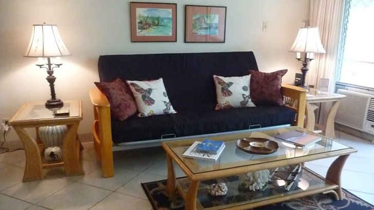 While a futon may be comfortable and practical, especially for people who have pets, they’re just not going to make your living room feel formal. Futons usually don’t live up to the expectations your other furniture has for it, and it sticks out like a sore thumb. Stick with a sectional, or recliners that provide the same comfort without compromising style.
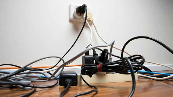 One of the most frustrating problems that arises in living rooms is that you also want it to be stocked with the best electronics for entertainment. And while companies have gotten better about making things wireless, power cables, HDMIs, and all the other things that can get tangled at the power source can really ruin a room. Make sure to tie and conceal them away.
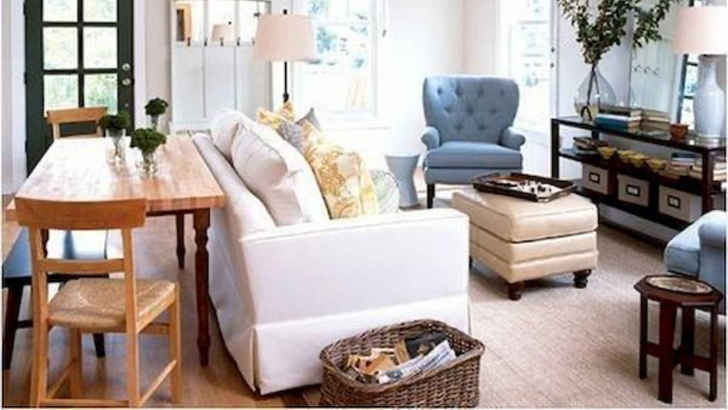 One problem that people don’t think of when their living room is the first place you enter in the home is how likely you are to just leave random temporary furniture there for the time being. Whether it’s a chair you just got and don’t know where to put, or a coffee table you’re holding for someone, it’s more obvious than you think, and likely doesn’t fit. Try to avoid this by storing elsewhere.
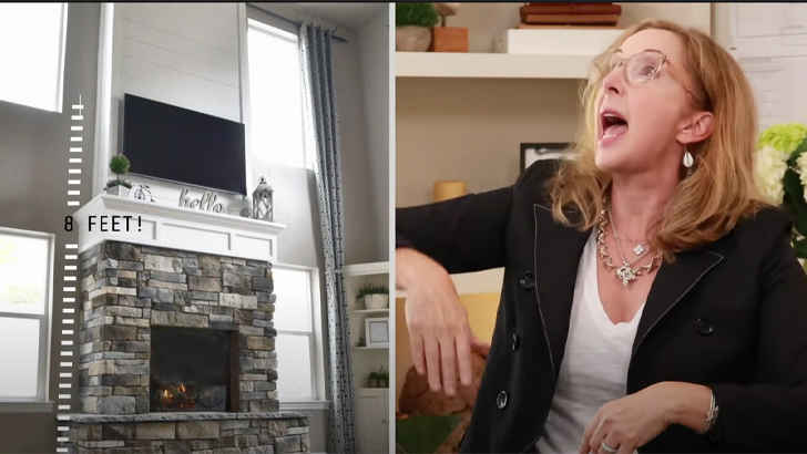 Although the idea of an artificial fireplace seems nice from an aesthetic perspective, it just doesn’t offer the same charm a real wood fireplace does. You can tell it’s not real by how it sits within the walls, and the heat is nowhere near as nice as a real fire. All that, and it tends to leave behind smells of gas.
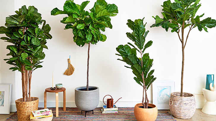 Sure, fake plants may seem like a good idea if you’re standing in the store and wondering how to spruce up your room without any effort, but don’t even think about it. Fake plants are unappealing and corny, and ultimately show you just aren’t willing or capable to take care of real ones. If you want green, go real or bust.
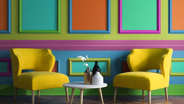 You definitely want a lively color when designing your ultimate living room, but going too bold can honestly backfire pretty quickly. Having a strong wall tone can feel overwhelming, and ultimately makes it harder to complete the room, because everything else needs to fit the vibe. Intense paint is always good in theory, but it’s almost always better to stick to subtle shades.
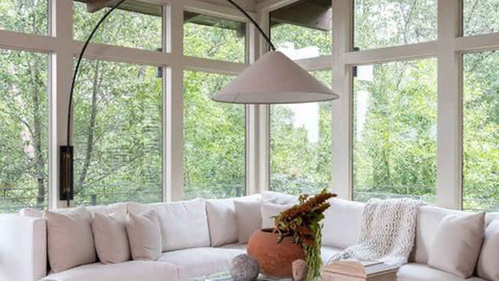 Windows are pretty crucial when it comes to shaping what a room is capable of, largely because they control the natural light. However, if your windows don’t have curtains, you’re going to be limiting your room’s flare, while also leaving yourself exposed at night. Windows need curtains for more than just the practical purpose. They’re also a great accent that lets you change feels.
 Art is a fairly controversial topic when it comes to design experts, as the jury is basically conflicted on whether it helps or hurts people’s living rooms more. Certain art can define a person or theme, but it’s easy to misplace “scenic” and “beautiful” art if they don’t correlate with a room’s color scheme. Also, stay away from any tacky classics, which just seem too try-hard.
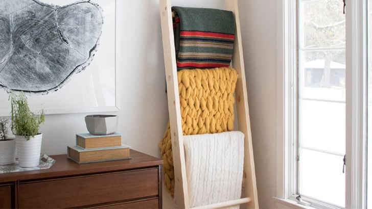 Unfortunately, that ladder you have propped against your wall that you’ve draped with blankets is a tad strange. First of all, the ladder serves no true utilitarian purpose, and too many blankets also gives a more lazy than cozy vibe. If you want to have a bunch on hand, try storing them in an ottoman or foot rest. The effort is appreciated, but it doesn’t feel authentic.
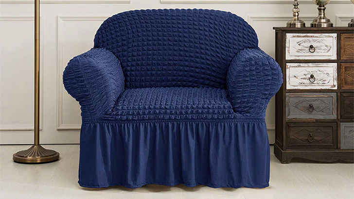 If you really want to date your living room, you’re going to have furniture that has ruffled skirts. These could not look more outdated, and show that you really don’t care to have a modern approach to the room’s design. Stick to cleanly trimmed and sleeker furniture to give the room a more stylish feel, and ditch the extra fabric that only looks aged.
 Shelving is important in any room, since you put a wide variety of objects on them and they tend to be slim and more off to the side. However, floating shelves raise a couple problems – first, they immediately draw attention to themselves, and the things up on them are bound to get dusty easily, or be hard to maintain if they’re plans or something. Avoid the hassle beforehand and don’t even think about implementing these.
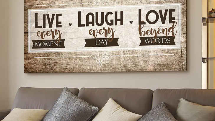 You know exactly what we’re talking about. “Live, Laugh, Love.” Don’t do it. “Bless this Mess.” No, you shouldn’t. “This is Our Happy Place.” Not anymore. These are not, and never will be okay, and if you ever think they are, you’re wrong. Talk about an all-time high on the cheesy scale.
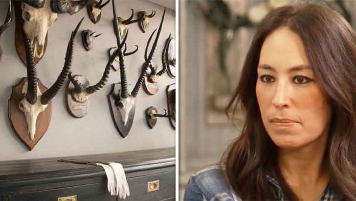 It’s kind of hard to believe anyone would actually want a huge taxidermy head staring at them whenever they’re in the room, but if you hunted it yourself, maybe we’ll let it slide. Either way, not really something to put in your living room, definitely because it’s creepy, but mainly because it almost never meshes well unless you’re in a total cabin themed living space, and even then, why?
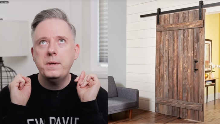 Of course it seems like a cool idea to implement a sliding barn door as a room divider, but let us tell you that it most definitely is not. Not only does it stick out like a sore thumb, but it applies a fake rustic look to the room, which asks too much of the rest of the decor. Keep it simple, and go with no door at all before adding the barn door.
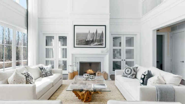 Since the turn of the century, there’s been an increased fascination with all-white themed living rooms, but let us tell you that it comes off extremely strong. Not only is the whole room bright and very prone to dirt and stains, but it gives off a snarky vibe leading guests to assume your home is no fun and you’re a neat freak. Color gives your room character.
 Shag carpeting is a thing of the past, and it’s definitely a fad we should leave there. Nowadays, modern style is much more sleek, and as we pointed out earlier, obnoxious carpets can throw off a room. If you have kids who spill or pets, shag carpeting is especially bad, so try and limit to thinner, more solid-toned rugs that complement rather than distract.
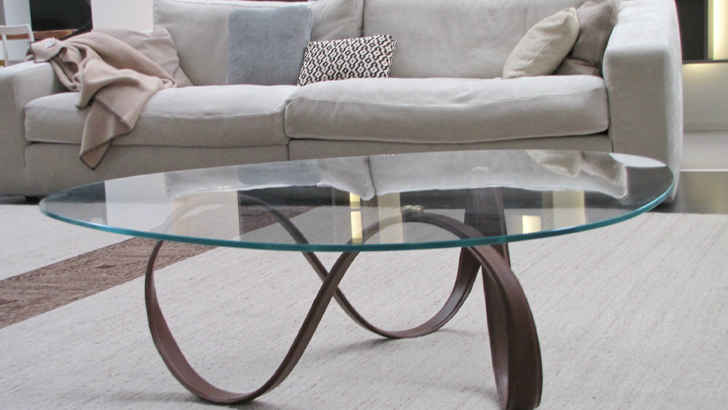 Glass furniture was definitely something that was more popular in the ‘90s, and while it seems clean and versatile, it’s often the opposite. Glass easily shows off fingerprints and dust, and oftentimes the trimming is shiny and feels out of place if the other furniture isn’t also as modern. You’re better off sticking to wood or other more solid styles of furnishings.
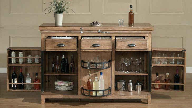 We get it, you’ve been to a lot of places, but as if collecting touristy shot glasses isn’t tacky enough, using them as a focal point of your room is the next level. Keep your drinkware and alcohol out of your living room, as it shows you’re a bit too enthusiastic about partying, and could give the wrong impression of your personality.
 Some people will try and tell you there’s no such thing as too many pillows, but those individuals are wrong. If people want to sit on your couch, you shouldn’t have to discard a ton of pillows to make room, and it’s an added problem to need somewhere to put them. Keep it simple with a limited amount of functional pillows, and you’ll save yourself the headache.
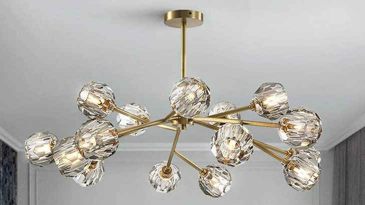 Much like glass furniture, gold trimmings on various fixtures around your living room pose immediate problems for the eye, creating mismatched accents when gold isn’t an official color of the room’s theme. Gold now looks outdated in comparison to modern decor trends, so in efforts not to date yourself, avoid these older items in your most forward-thinking room.
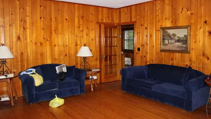 Wood belongs on floors, but not so much on the walls. Paneling like this is sure to make your room look outdated by at least 30 years, and again, though the cabin-like rustic feel may seem good in theory, it just looks played out and darkens your room. Don’t force yourself into a wood aesthetic unless you’re in the right rural area for it.
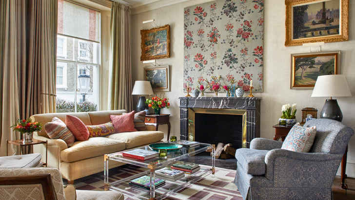 You see this one all the time. Striped pillows on patterned couches. Bright, geometric rugs in brick rooms. Wild blankets and oddly colored curtains. Stick to clean, simple patterns and only 2-3 subtle colors to really make your room pop, because the more busy it gets, the more distressing it will be to even be in it.
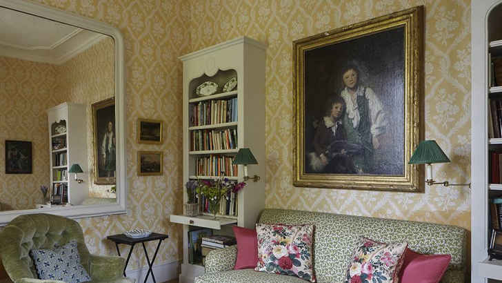 In general, wallpaper has really become an obsolete feature to almost any room in any house, but boy does it look suspect when it’s in the living room. This shows you don’t care much to update your house to the latest styles, and probably gives guests the idea that you’re oblivious to how cheesy it makes a room feel. Don’t age yourself so easily.
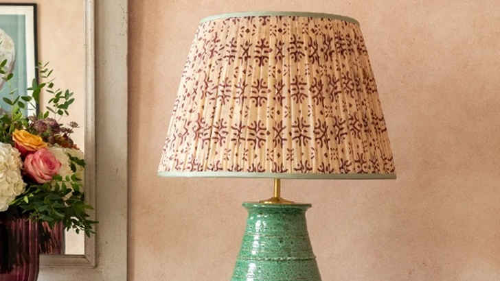 If you happen to travel to Turkey and are thinking about purchasing a uniquely patterned lampshade to give your room some pop, do yourself a favor and don’t. Not only is this going to be completely out of place in comparison to the rest of your stuff, but it’s also sort of obnoxious. Not worth the conversation starter.
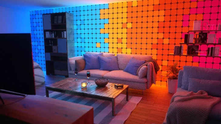 Sure, we hear you – you want to fit in with your millennial children or just want to give your living room a more club-like vibe. Well, not sure it’s the best idea, aesthetically or for your electric bill. It feels pretty daunting if your room is constantly changing, mostly because it can become emotionally draining. Having to adjust to changing light isn’t very comforting for visitors.
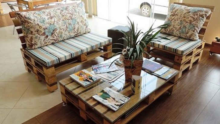 Again with the bucolic furnishings. They just don’t give you the character you think you’re achieving, and a problematic consequence is also how easily they stain, considering they’re just refined wood. Save yourself the assimilation process and make sure you keep a more consistent theme rather than drawing focus to a table.
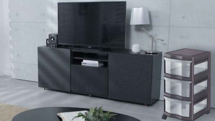 Nothing shows your living room is in limbo like having cheap plastic storage with assorted items in it around the walls. Either it shows you’re unable to get organized, or a hoarder, neither of which you really want. It surely looks tacky, and shows you’re improvising as you go rather than decorating the room to your preference.
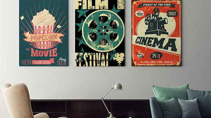 Posters can be a great addition to any living room, as they can provide a variety of different feels whether it be artful, or more pop culture focused like movies or band posters. However, if you can’t frame these, they tend to look half as good, and ultimately make it look like you just threw something up to fill the space.
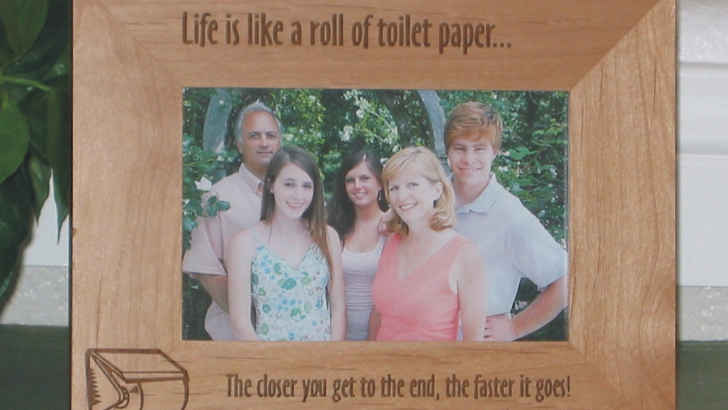 We all love seeing your smiling family on the bookshelf or in some nice frames around the living room, but the moment you stick them in a “Rather be Fishing” or “Got it from my Momma” frame, you’re losing the appeal of the picture and drawing attention to a cliche phrase. Just let the picture speak for itself in a clean frame.
 Something that may not seem like a big deal at first, but you’ll probably regret later is matching your pillows to your couch. You’d think it looks seamless, but it actually makes the couch look chunkier, and prevents you from having a contrast that could compliment your room. Try and have your pillows match your drapes or carpet with soft tones if possible.
 If you want something like a bookcase, stone or a scenic view from your home, we don’t recommend putting up fake wallpaper to achieve your dream. One of the tackiest things you can do is put wallpaper on an entire wall of an artificial look or scenario, because it’s so obvious it’s fake, it’s more puzzling than it is cool. Save yourself the embarrassment.
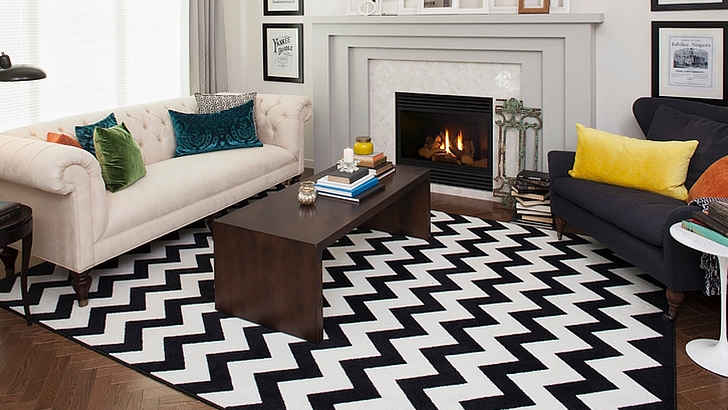 The Chevron style has overstayed its welcome, and it’s probably time you leave it behind rather than trying to make your living space feel like a ‘70s cafe. The black and white quirky pattern may have seemed posh or kitschy at some point, but we’ve come to the conclusion that it’s distracting and busy at the very least. Fad’s over.
 Whatever you do, don’t post worded quotes on your wall for any reason, we’re begging you. Just because you supposedly live by a phrase doesn’t mean you or anyone else need to be reminded of it every time you step into the room. It’s very cheesy and sort of just insists you don’t really get interior design.
 Like knick knacks, little wooden figures are cute and applicable in certain settings, but randomly placing wooden animals around the room to create a more outdoorsy vibe is just a bit too tacky for our liking. Figurines only take up space and collect dust, so don’t waste your floor or shelf space with things that serve no purpose.

ADVERTISEMENT - CONTINUE BELOW
Knick Knacks

ADVERTISEMENT - CONTINUE BELOW
Strange Lamps

ADVERTISEMENT - CONTINUE BELOW
Curtains That Match the Couch

ADVERTISEMENT - CONTINUE BELOW
Frameless Photos

ADVERTISEMENT - CONTINUE BELOW
Plastic Couch Covers

ADVERTISEMENT - CONTINUE BELOW
Small Rugs

ADVERTISEMENT - CONTINUE BELOW
Futons

ADVERTISEMENT - CONTINUE BELOW
Tangled Cables

ADVERTISEMENT - CONTINUE BELOW
Temporary Furniture

ADVERTISEMENT - CONTINUE BELOW
Fake Fireplace

ADVERTISEMENT - CONTINUE BELOW
Fake Plants

ADVERTISEMENT - CONTINUE BELOW
Intense Walls

ADVERTISEMENT - CONTINUE BELOW
Curtainless Windows

ADVERTISEMENT - CONTINUE BELOW
Clichê Art

ADVERTISEMENT - CONTINUE BELOW
Blanket Ladder

ADVERTISEMENT - CONTINUE BELOW
Furniture Skirts

ADVERTISEMENT - CONTINUE BELOW
Floating Shelves

ADVERTISEMENT - CONTINUE BELOW
Worded Signs

ADVERTISEMENT - CONTINUE BELOW
Mounted Heads

ADVERTISEMENT - CONTINUE BELOW
Barn Doors

ADVERTISEMENT - CONTINUE BELOW
White Room

ADVERTISEMENT - CONTINUE BELOW
Shag Carpet

ADVERTISEMENT - CONTINUE BELOW
Glass Furniture

ADVERTISEMENT - CONTINUE BELOW
Liquor Cabinet/Shot Shelf

ADVERTISEMENT - CONTINUE BELOW
Excessive Pillows

ADVERTISEMENT - CONTINUE BELOW
Golden Fixtures

ADVERTISEMENT - CONTINUE BELOW
Wood Panelling

ADVERTISEMENT - CONTINUE BELOW
Mismatched Patterns

ADVERTISEMENT - CONTINUE BELOW
Weird Wallpaper

ADVERTISEMENT - CONTINUE BELOW
Strange Lampshades

ADVERTISEMENT - CONTINUE BELOW
Color-Changing Lights

ADVERTISEMENT - CONTINUE BELOW
Pallet Furniture

ADVERTISEMENT - CONTINUE BELOW
Plastic Storage

ADVERTISEMENT - CONTINUE BELOW
Frameless Posters

ADVERTISEMENT - CONTINUE BELOW
Cheesy Frames

ADVERTISEMENT - CONTINUE BELOW
Matching Pillows

ADVERTISEMENT - CONTINUE BELOW
Fake Wallpaper Backdrops

ADVERTISEMENT - CONTINUE BELOW
Chevrons

ADVERTISEMENT - CONTINUE BELOW
Word Decals

ADVERTISEMENT - CONTINUE BELOW
Wooden Animals

ADVERTISEMENT - CONTINUE BELOW
ADVERTISEMENT - CONTINUE BELOW
About Money+Investing
Money + Investing provides our community with the latest personal and business finance news from around the world. We publish money saving and earning tips to help you make smartier investing decisions. We're inspired by exploring and providing new ways for our audience to achieve financial freedom. We can't wait to share all of our exciting deals, guides and reviews to help you live your financial life to the fullest.
More Money + Investing
-


The Rarest Diseases Known To Man
-


The Greatest Moments Throughout Sports History
-


Unsolved Scientific Mysteries From History
-


Celebrities Who Have Changed Their Look
-


Travel Hacks To Ensure A Carefree Vacation
-


The Most Memorable And Surprising Deals Made On Shark Tank
-


Cleaning Hacks To Make Dirt Disappear
-


Vintage Postcards That Capture Women’s Beauty From 100 Years Ago
-


Insanely Awful Park Jobs
-


Wonderous Nature Photos
-


Amazing Wives And Girlfriends of MLB Stars
-


Strict Rules The Hells Angels Must Obey
